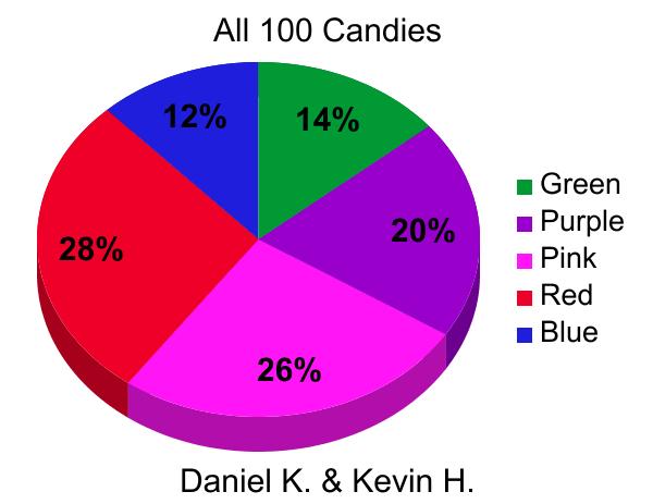
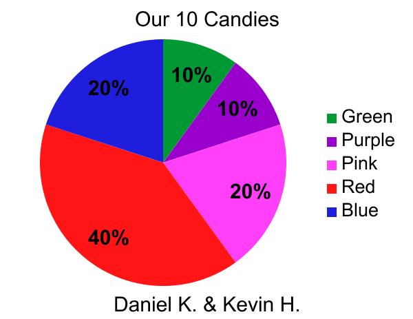
Today in class we did graphs of 100 in the class but ten per partnership.What I noticed is that the 10 candy pie graph was not helpful when predicting the 100 candy or whole class chart.For example 10% in my graph is off by ten the class average was 20%. Sample Size is a main key in charts.The more people that you interview the more data you will get.For Example a class of ten you take a boy without a pet and a boy with a pet and ask them a question it is a the average execrate, execrate.
| To make a graph here is the link.http://nces.ed.gov/nceskids/index.asp |


 RSS Feed
